Moving in Nairobi
2019-2020
Project Leads
Sarah Williams
Researchers
Carmelo Ignaccolo
Dylan Halpern
Collaborators
Lambert Coleman
Paula Aguillera
Tess McCann
Project Leads
Sarah Williams
Researchers
Carmelo Ignaccolo
Dylan Halpern
Collaborators
Lambert Coleman
Paula Aguillera
Tess McCann
Overview
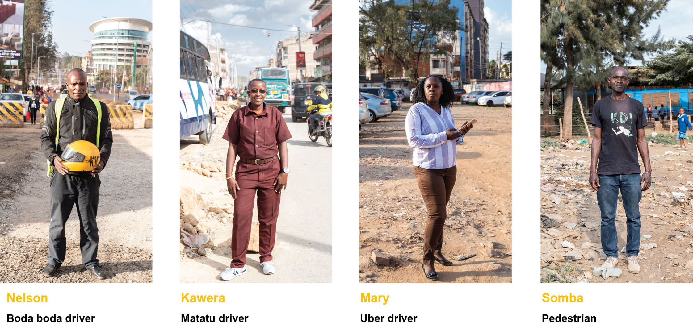
"Moving in Nairobi"—exhibited by the CDDL in Seoul (2019) and Nairobi (2020)—captures the city of Nairobi through the eyes of four commuters travelling by foot, bicycle, motorcycle, and bus. Additionally, a time-lapse video of an Uber ride illuminates the city, rich and poor sectors alike, allowing the viewer to see and hear the city's rapidly evolving urban fabric.
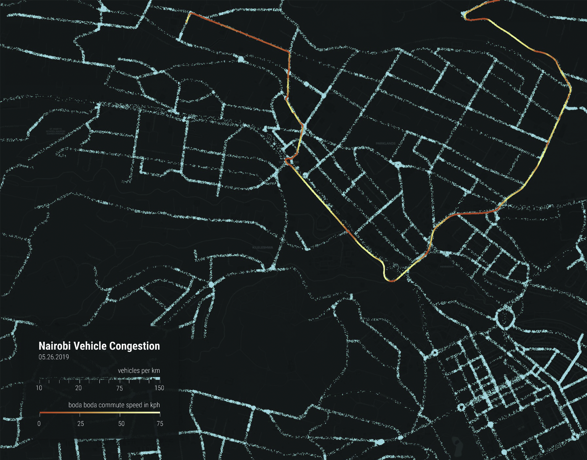
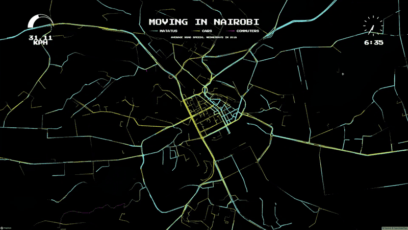
Nairobi is home to 3.5 million people. Due to a lack of centralized transport planning in its history of growth, present-day urban traffic is often paralytic and commuters may be trapped in their cars for several hours each day. This work screens citizen traffic data collected from Uber, mobile phone, and Google data, displaying visualizations of Nairobi's breathtaking traffic congestion on an exhibit wall. These visualizations are presented in conjunction with the travel routes of four selected Nairobi commuters postulate the link between their personal experiences and urban traffic problems.
"Moving in Nairobi" also presents analysis of this traffic issue in the form of an infographical newspaper pamphlet, which was distributed in Nairobi. This pamphlet was made available as part of the exhibit in both Seoul and Nairobi.
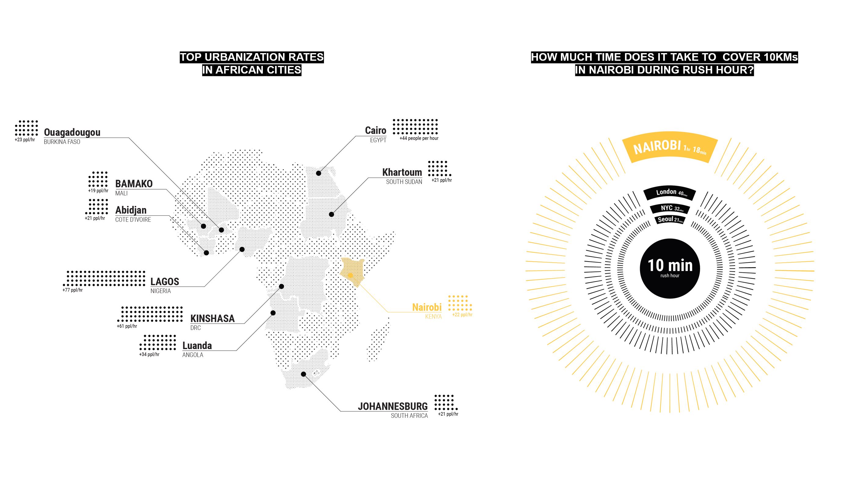
Infographics of (a) urbanization rate in Africa cities and (b) average time spent in traffic for a 10-km commute. Based on World Bank urbanization data, 22 people relocate to Nairobi every hour. In terms of congestion, it takes 1hr 20min to cover 10 km during rush hour.

"Moving in Nairobi" builds a comparative taxonomy of different transport options. Through these infographics, it is easy to compare prices, vehicle capacity, and commute time.

Press
︎︎︎ Google Arts & Culture
︎︎︎ Google Arts & Culture