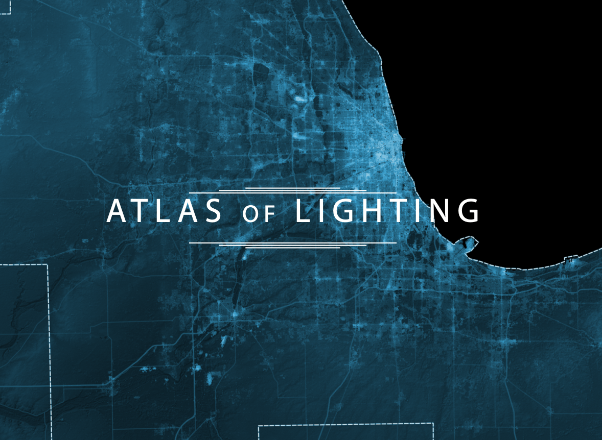
Atlas of LightING
2014-2017
︎︎︎ Project Repo
Project Leads
Sarah Williams
Alan Berger
Project Manager
Hayrettin Gunc
Researchers
Armin Akhavan
Casey L. Brown
Andres Achury
Garcia Dennis
Cameron Harvey
Thuy Le
Ege Ozgirin
Wenzhe Peng
Rida Qadri
Kalli Retzepi
Sera Tolgay
Jia Zhang
Collaborator
Norman B. Leventhal Center for Advanced Urbanism
Support from
Philips Lighting
Overview
Today’s digital revolution has revolutionized the way we process the volume of information that cities produce every day. Especially with the emergence of digital data and ubiquitous use of mobile social network services, new opportunities arise for researchers to develop tools grounded in new data sources. What makes these sources particularly useful for geospatial analysis is that they are available across municipal, provincial, and national borders. Wherever the web service has users, data is available which means that researchers are no longer dependent on conventional data sources.
Atlas of Lighting is a joint project between Philips, MIT Center for Advanced Urbanism and MIT Civic Data Design Lab that responds to the need for an integrated and scientific understanding of the dynamics of metropolitan areas around the world. It is an interactive mapping tool in which the user can combine, isolate or cross-reference both quantitative and qualitative datasets to get a clear view of how cities operate. The tool has a potential to create the first comprehensive city dashboard anywhere that digital data exist. While it can be used by researchers and practitioners to identify and analyze socio-spatial processes, it can also be an engagement tool with public and open up new possibilities for participation.
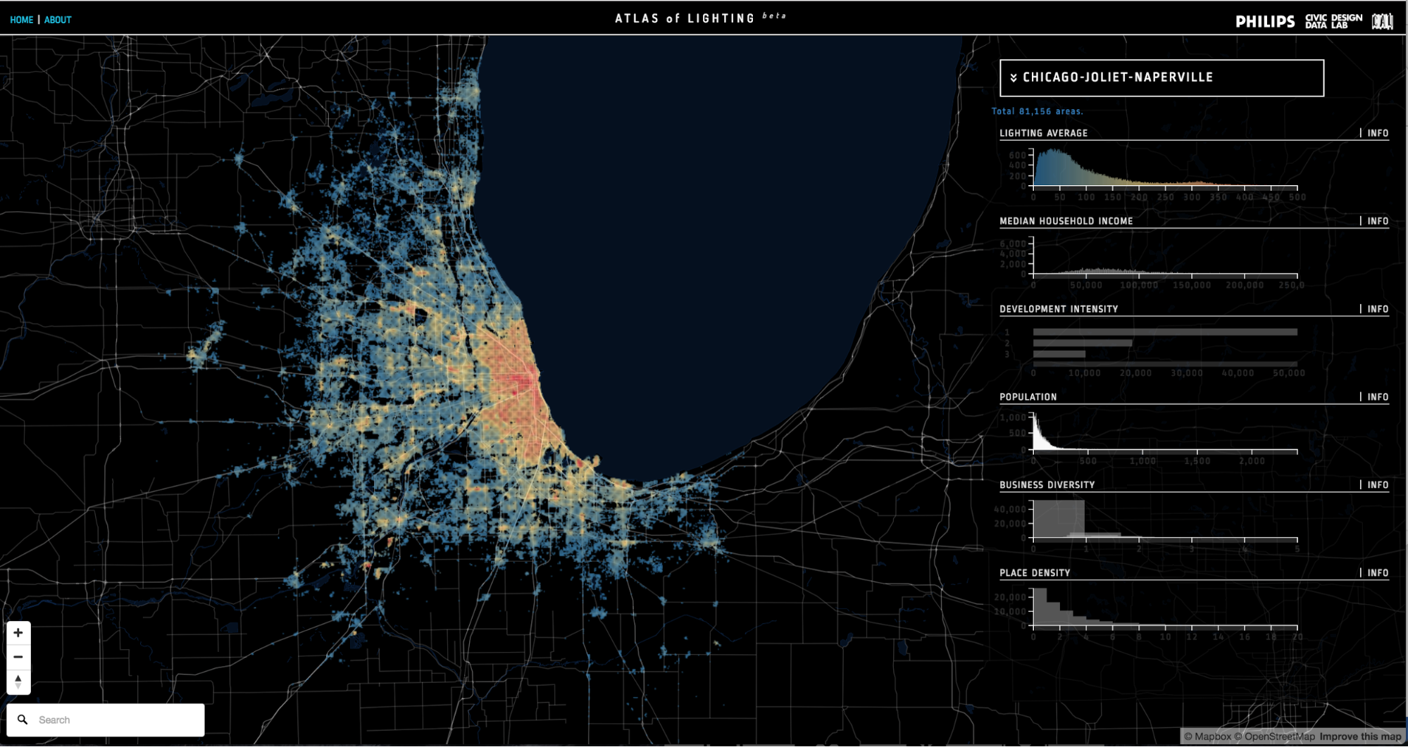
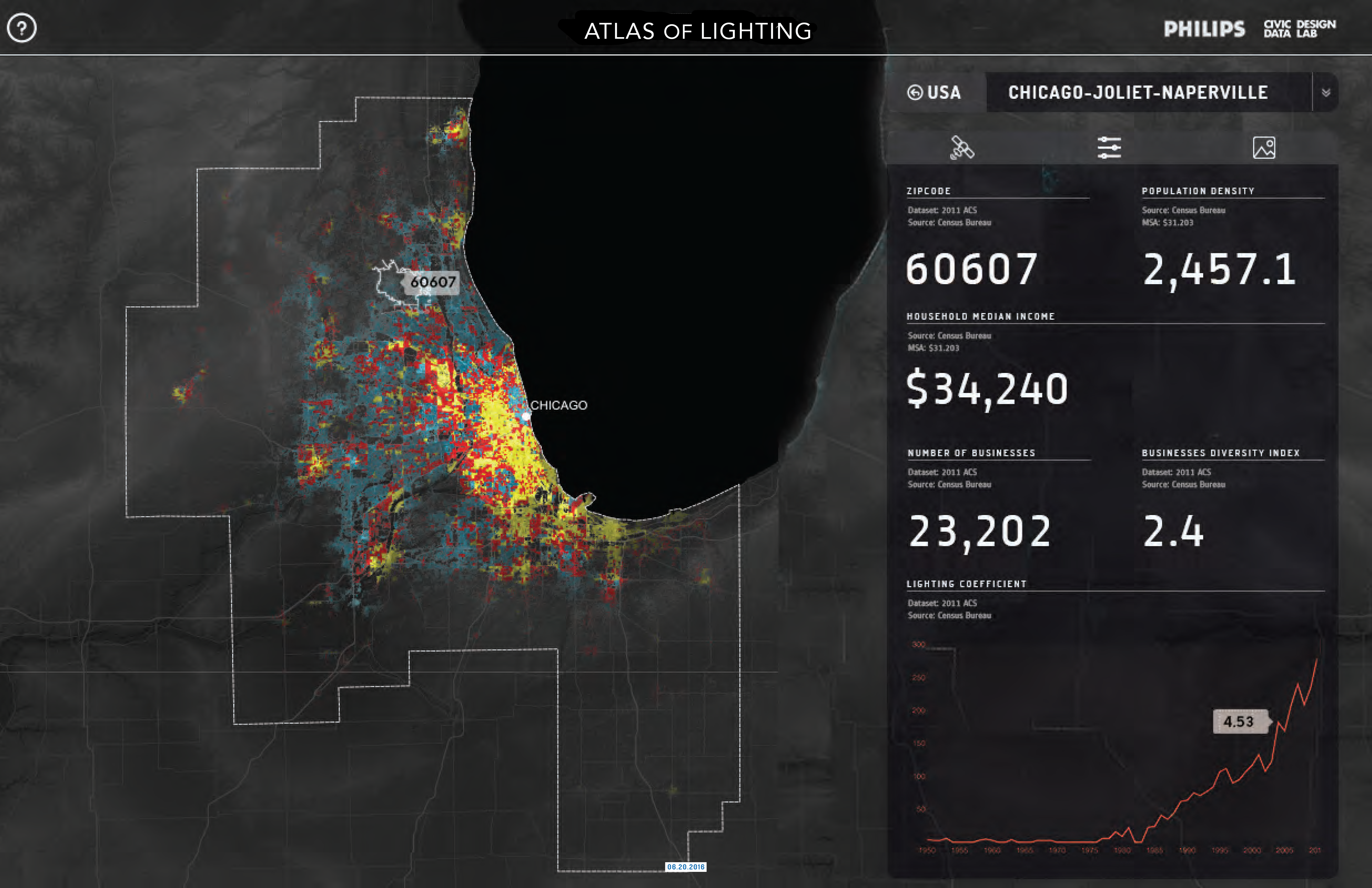
For the first year of the project, the team decided to focus on how lighting intensity varies by various types of socio-economic conditions in Chicago Metropolitan Statistical Area. The tool currently brings together statistics on demographics, intensity of urban development, and night time light intensity using satellite imagery. In addition to these, the tool also displays quantity and diversity of all the Google Places which is a collection of geo-referenced businesses, institutions, parks, and other points of interest. Lastly, geotagged Instagram posts are used as a proxy for human activity which lets the user to explore the city through the eyes of its users. While an individual geotagged Instagram post might not mean anything, collectively they can be cross-referenced to understand qualitative knowledge about places and interactions.
The tool can be utilized in various ways for spatial analysis. One initial experiment used the tool to analyze the relationship between lighting intensity, household median income and population density. The tool helped Philips to adapt different business strategies and best position and calibrate its products to improve quality of life in different parts of the metro area. In another experiment, the research team utilized the tool to identify urban places that generate trips of people to and from their built form. Defined as “Urban Attractors”, these areas are identified by georeferenced Instagram posts and categorized into different types by Google Places data. The research is not only a promising attempt to use digital data as a means of analyzing a cities morphology, but also it is useful for policy makers to understand the nature of development in peripheries or planning of business districts. Researchers at the Civic Data Design Lab is currently working on the 2.0 version of the tool. The upgraded version will include datasets for four additional metropolitan areas, as well as a new database that will make the tool scalable for different projects.
-

Hacking Data
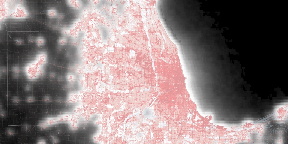
In order to measure the social and economic diversity of each region at a spatial scale better than traditional data sets, such as the economic census, which comes at zip code level, the research team scraped detailed business data from Google Places. The Google Place data included metadata about each location including variables such as “opening hours” which was used to understand overall activity across the region. A fishnet grid was used in each city so that the data could be compared. The grid also helped derive data. The diversity index helps highlight urban hubs across the metropolitan area.
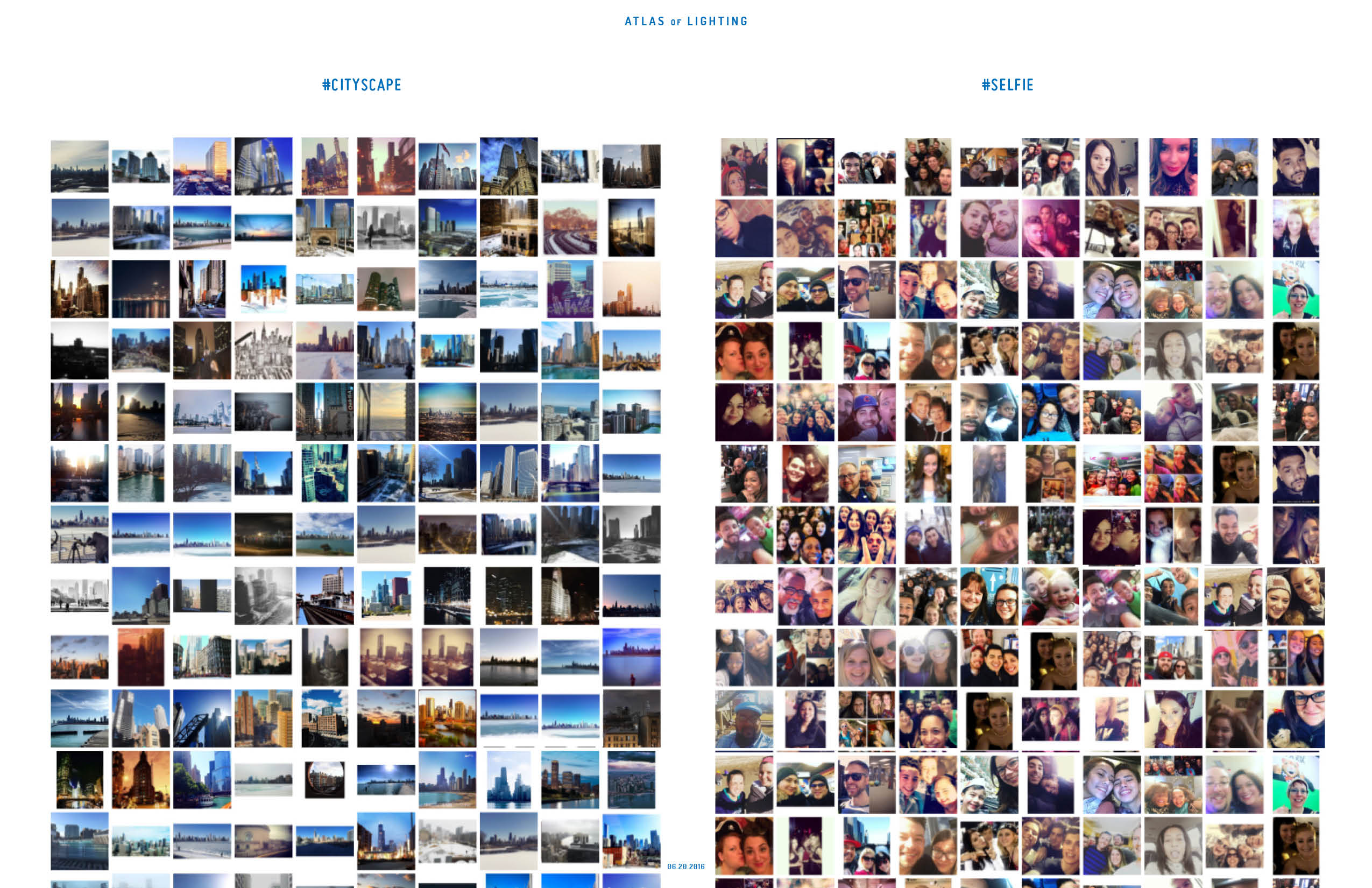
Instagram’s API was also used to download all the images in each metropolitan area for a two week period. The photos were then run through an image analysis package to determine the content of each picture -- cityscape, selfie, architecture, garden, sports, food, etc. These labels were run through a machine learning algorithm to determine the topics of each image. These topics were applied to each grid cell on the website. This allowed users to explore the city through the topics of the images rather than traditional datasets.
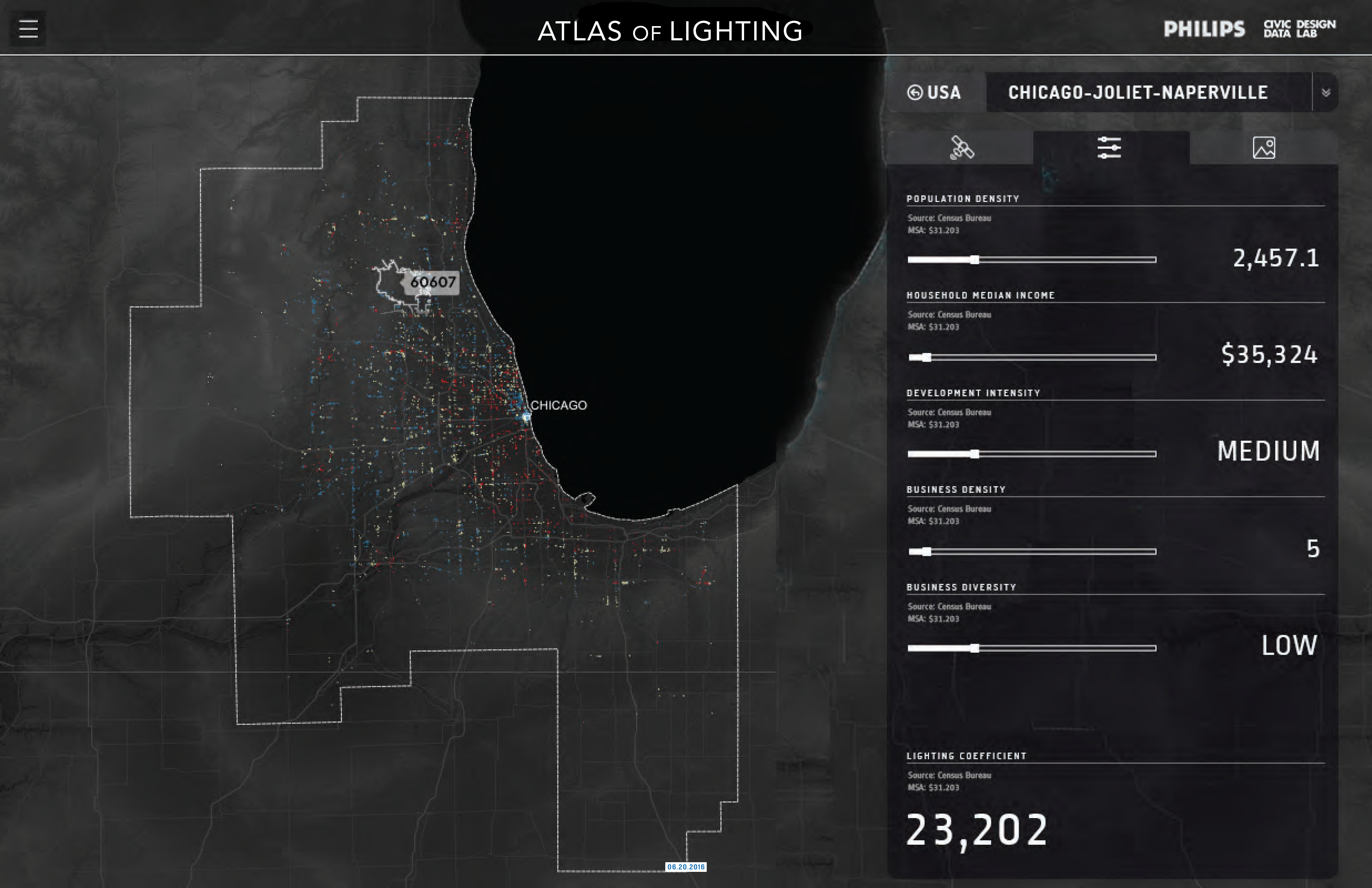
 On the left side is a data menu users can click and drag the data to the right side to make it viewable on the map.
 Click the fashion topic from the Instagram menu and it will show any cell that has a fashion topic.
 As you zoom into the cells the exact data for the cell is generated.